Concept art is a form of illustration used to convey an idea for use in films, video games, animation, comic books or other media before it is put into the final product. Concept art is also referred to as visual development and/or concept design.
Concept art ranges from the stylised to the photo realistic. This is facilitated by the use of special software by which an artist is able to fill in even small details pixel by pixel, or utilise the natural paint settings to imitate real paint. When commissioning work, a company will often require a large amount of preliminary work to be produced. Artists working on a project often produce a large turnover in the early stages to provide a broad range of interpretations, most of this being in the form of sketches, speed paints, and 3D overpaints. Later pieces of concept art, like matte paintings, are produced as realistically as required. Concept artists will sometimes have to adapt to the style of the studio they are hired for. Most concept artists can do multiple styles.
Concept art has always had to cover many subjects mainly being film posters in the early times of Hollywood but today it has had to cover fantasy and science fiction.
Concept art is also used to show off games and their potential
I would love to recreate a piece like this based off of a game e.g Destiny ,changing the lightsaber into a sword with lighting effects around it. Trying to create a piece like this would test my skills more than they have ever been tested previously. The hardest thing about this would be making the figure look proportioned as i am not good at drawing figures.Also the hand could become difficult,making look like its holding the sword with making it look to weird as if the sword is floating.
To help me i would use rule of thirds and golden spiral. I would also add a focal
point using a polygon with these settings
When created it looks something like this which when put with the golden spiral can help create the perspective. and to create a horizon line.
____________________________________________________________________
Shading
Shading creates depth perception in 3d models or illustrations by varying levels of darkness.
Shading is used in drawing for depicting levels of darkness on paper by applying media more densely or with a darker shade for darker areas, and less densely or with a lighter shade for lighter areas. There are various techniques of shading including cross hatching where perpendicular lines of varying closeness are drawn in a grid pattern to shade an area. The closer the lines are together, the darker the area appears. Likewise, the farther apart the lines are, the lighter the area appears.

____________________________________________________________________
Rule of thirds
The rule of thirds is applied by aligning a subject with the guide lines and their intersection points, placing the horizon on the top or bottom line, or allowing linear features in the image to flow from section to section.
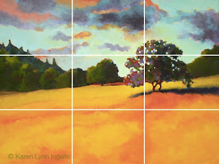
Golden Spiral
The golden spiral is used to create a focal point and the viewer often starts at the beginning of the spiral and follows it all the way to the centre/end.This is a good way to grab the viewers attention and make them appreciate all of the image.Perspective
Is the art of representing three-dimensional objects on a two-dimensional surface so as to give the right impression of their height, width, depth, and position in relation to each other.Also can be known as a point of view

This image has a perspective showing you the paths leads further on it does this by making the path thinner and thinner which makes it appear far away.
Colour
Colour can be used to do many different things such as make things look hot and cold also colour can attract the eye to certain points in the image.
 |
| This images uses a lot of blue and white to make it look and feel cold |
German Expressionism
Refers to a number of related creative movements beginning in Germany before the first world war that reached a peak in Berlin during the 1920's.These developments in Germany were part of a larger expressionist movement in the north central European culture in fields such as architecture,dance,painting,sculpture,as well as cinema.
its black and white with high contrast.
what ever happened to baby Jane:
is a 1962 American psychological thriller film produced and directed by Robert Aldrich, starring Bette Davis and Joan Crawford, about an aging actress who holds her paraplegic sister captive in an old Hollywood mansion. The screenplay by Lukas Heller is based on the 1960 novel of the same name by Henry Farrell. Upon the film's release, it was met with widespread critical and box office acclaim and was later nominated for five Academy Awards, winning one for Best Costume Design, Black and White.
This is a modern example of film noir. it has a sinister theme given off the the harsh shadows and high contrast.
This gives me the feel of its not a happy film and is meant to be sinister and is well given off by the harsh shadows and high contrast.
Käthe Kollwitz, In Memoriam Karl Liebknecht
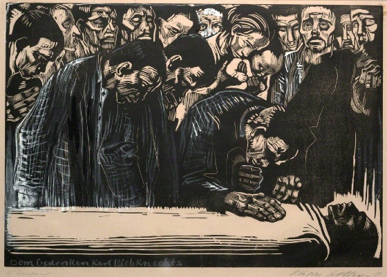 |
| This is a piece of artwork created by Kathe Kollwirtz as a response to the murder of Karl Liebknetch (1919). This has an emotional theme mainly being death.this is a original piece of German expressionism created in 1920.It makes me feel sad and as if i am there with them.I think this has been created by using lino and being drawn onto. |
Paul Leni: Waxworks (1924)
 |
| This is a film created in 1924 called waxworks created by Paul Leni it is a silent fantasy horror film.To give of a sinister feeling this uses black and white with high contrast and harsh shadows. This film feels like its not going to have a happy ending and makes me feel anxious about what will happen. |
Dr Jekyll and Mr Hyde 1931
 |
| This is a film made in 1931 directed by Rouben Mamoulian. The film uses harsh shadows ,high contrast and dealing with emotions. |
Clive Hicks-Jenkins circa 2000
 |
| This is a modern example of German expressionism it uses harsh shadows and high contrast including black and white (monochromatic). |
____________________________________________________________________
Monochromatic
Monochromatic is all the colours (tints,tone and shades) of a single hue.
Tones and tints are made by adding white and or a darker colours such as grey and black.
Using this colour scheme in art can allow for a greater range of contrast which can attract attention and create focus.
____________________________________________________________________
Basic Colour Theory
Colour theory encompasses a multitude of definitions, concepts and design applications enough to fill several encyclopedias. However, there are three basic categories of colour theory that are logical and useful.The color wheel, color harmony, and the context of how colours are used.
Colour theories create a logical structure for colour. For example, if we have an assortment of fruits and vegetables, we can organise them by colour and place them on a circle that shows the colours in relation to each other.
A colour circle, based on red, yellow and blue, is traditional in the field of art. Sir Isaac Newton developed the first circular diagram of colours in 1666. Since then, scientists and artists have studied and designed numerous variations of this concept. Differences of opinion about the validity of one format over another continue to provoke debate. In reality, any colour circle or colour wheel which presents a logically arranged sequence of pure hues has merit.
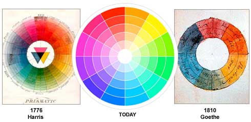
There are also categories of colours based on the colour wheel. We begin with a 3-part colour wheel.

Primary Colours: Red, yellow and blue
In traditional colour theory (used in paint and pigments), primary colours are the 3 pigment colours that can not be mixed or formed by any combination of other colours. All other colours are derived from these 3 hues.
In traditional colour theory (used in paint and pigments), primary colours are the 3 pigment colours that can not be mixed or formed by any combination of other colours. All other colours are derived from these 3 hues.
Secondary Colours: Green, orange and purple
These are the colours formed by mixing the primary colours.
Tertiary Colours: Yellow-orange, red-orange, red-purple, blue-purple, blue-green & yellow-green
These are the colours formed by mixing a primary and a secondary colour. That's why the hue is a two word name, such as blue-green, red-violet, and yellow-orange.
____________________________________________________________________
The Sublime
In Concept Art Environments
The sublime
has long been understood to mean a quality of greatness or grandeur that
inspires awe and wonder. From the seventeenth century onward the concept and
the emotions it inspires have been a source of inspiration for artists and
writers, particularly in relation to the natural landscape.
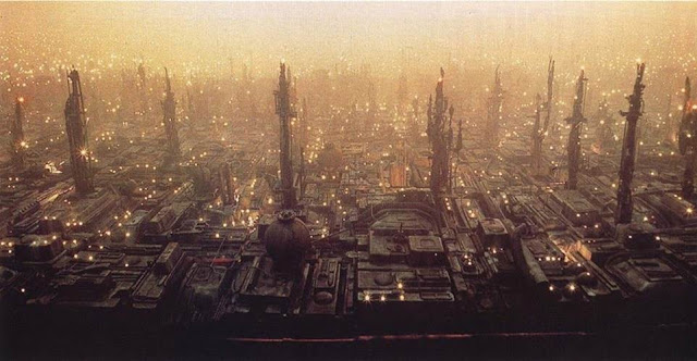
Concept Art by Syd Mead
Sublime is used
in concept art to give the viewer multiple views on one image and make them
think more about what could be happening or what’s happening next this can also
create immersion and immerse the player into the game and make them feel as if
they are the character.
This image uses sublime by making it light and dark this
makes the player think is the light a safe area and the dark somewhere to be avoided.
The use of a lot of lighting over the city makes the player want to go there.
German Expressionism mini project
 |
| Concept Art by Syd Mead |
This is a quick piece with the theme of German expressionism to create this i used the polygonal lasso tool to create the cityscape and then used the fill bucket to add the colour.For the background i used a low opacity soft brush with red and orange.
This uses the golden spiral and has leading lines.
This uses the golden spiral and has leading lines.
In this image the hanging man is dominant and the castle is the sub dominant.Also this images uses saturated colour as fire drawing your eyes to the castle and you get a sense of how dangerous it would be in the castle.
I decided to change the same image around to make it fit the rule of thirds because it makes the image flow better and focuses your eyes to each detail.. Also the composition looks better in this than the original,by making the castle smaller it seems further away.
To create most of these pieces i have used the polygonal lasso tool in Photoshop to make the skyscrapers and roads.Also i used a graphics tablet and a pen over using a mouse because it allows more freedom. to shade i have used a soft brush with a low opacity this creates a good effect and i think it works very well.
Character Designing
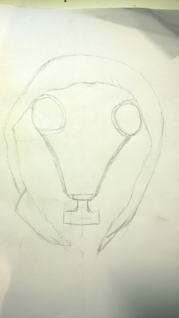
These are my character designs the design is a person wearing a gas mask with their hood up.i don't like these designs because they aren't that detailed and are not good quality.
Creating these traditional sketches has helped me plan for what the character would look like
Creating these traditional sketches has helped me plan for what the character would look like
I decided the other designs were not good enough so i created a better more detailed one.
Its not finished as of yet.
There will be a light source coming from behind the figure so it will be relatively dark under the hood.
____________________________________________________________________
Cityscape
To plan our cityscape we got some cardboard and created out cityscapes by cutting and sticking cardboard together we we're in groups.
This was ours we all made a piece to it i made the bottom 4 house on the cardboard.
I really like this it looks as if it would be German expressionism by the different shaped houses.I used this primary resource to help draw the buildings myself.
After we made these we we're tasked to sketch them on paper.
 |
| This is my second design,there houses are to far apart. |
 |
| This is my final sketch and my favourite. |
 |
| This was the outline/plan for my cityscape design. i used the rule of thirds because it makes the image flow better. |
German Expressionism lighting
We decided to put theses into Photoshop and edit them.
 |
| In Photoshop i made it black and white also i changed the brightness and contrast using the adjustments making the shadow harsher and more sinister |
Caravaggio:
 |
| This piece of art is by Caravaggio and uses chiaroscuro by making medusa's face light and the shadow behind her extreme.This creates suspense and adds a depth to the image. |
Leonardo Da Vinci:
 |
| This is by Leonardo Da Vinci and uses dark shadows to slightly hide the figure and give a sinister vibe to it. |
Rembrandt:
 |
| This uses chiaroscuro to the dark shadow behind the figure gives it a sinister feel and makes you think what he has done or what he is going to do. |
German Expressionism Final Piece
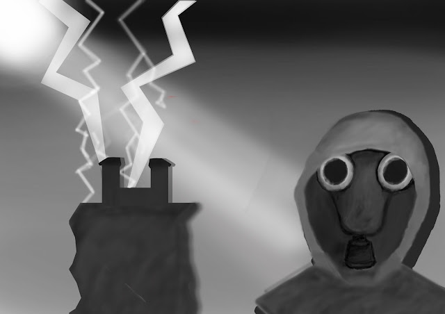
This is my German expressionism piece completely finished. I think it came out really well i like it a lot,my favourite part is the gas mask figure which took the majority of the time to create this piece.
To create this i have used golden spiral and rule of thirds also this piece has a monochromatic colour scheme using darker and light shades of grey.I have made a light source being a white sun at the top left of the image, shining down onto everything therefore creating shadows. The shading was made by using a low opacity soft brush or the burn tool.the lightning was created by using a low opacity line tool.
Also to create this piece i have used rule of thirds which makes the image flow better. This piece also uses golden spiral to attract the eye to each piece in the artwork.
If I had more time i could have added extra details into the background e.g. more buildings or birds if i was given more time i would also like to perfect the character with more detail such as i wanted to make the eyes glow white but i didn't have enough time.
Overall I adore this piece I have created and if you ask me to create this at the start of this course it wouldn't look this good that is because along this course I have developed my skills and techniques, but there is still a long way to go before i can create anything i'd like but i have a long time to develop my skills into what i want them to be and this course will teach me all i need to step into my career.




No comments:
Post a Comment